Proposal Builder for Admins
Admins can customize every aspect of their organization’s proposals to ensure consistent branding style, messaging, and proposal structure. The initial setup can take as little as 20 minutes, but it needs to be completed before Account Managers can begin creating proposals.
To open Proposal Builder to Admin Home, use Launch Point #1 in Sagitta (see the Proposal Builder Launch Points section).
 Settings
In Settings, you can manage options for proposal creation, storage, and exporting as a Word document.
-
Click the Settings tab on the left-sided menu of Proposal Builder.

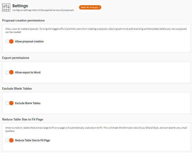
- From here the Admin has the option to set up the Proposal Creation Permissions, Storage Options, and Export Permission.
Proposal Creation Permissions
The Proposal Creation Permissions manage whether users can create proposals. It is set to ‘Off’ by default so that you can create your organization’s Brand Styles, Reusable Sections, and Proposal Templates before Account Managers attempt to create proposals. When you have created the content that you need, toggle ‘On’ this permission.

Export Permissions
Export Permissions manage whether users can export the proposal to Word for further editing. This setting is ‘On’ by default.

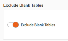
Export Blank Tables
You have the option to exclude blank tables from your proposal.
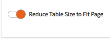
Reduce Table Size to Fit Page
When turned on, tables that are too large to fit on a page will automatically scale down to fit. This will break the font-size rules of your Brand Style and can lead to very small typeface.
Set Up Brand Styles
Brand Styles allows admins to set standard style formats for their organization’s proposals. To begin, click Manage Brand Style from the Admin Home page, or click Brand Styles on the left-sided menu of Proposal Builder.

|
Note: Create as many different Brand Styles as necessary to meet your organization’s needs. For example, you may choose to create a Brand Style for different offices or regions, or create a single Brand Style. |
Brand Styles begins with the option of editing an existing brand style or creating a new brand style.

Create New Brand Style
-
If needed, create new Categories to organize your Brand Styles.
-
Click Create New Brand Style in the top-right corner of the screen.

-
In the modal, name and categorize your new Brand Styles. Click Save to continue.

Edit Existing Brand Style
-
To edit an existing brand style, click the Pencil icon on the right-hand side of an existing brand style.

-
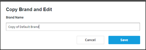
To Copy an existing brand style, click on the Copy icon then name and Save your new Copy.

-
You also have the ability to set the status of the existing brand style to In Draft, Active, and Archived:

-
If you wish to delete a Brand Style, you must first change its status to Archived. A delete (trashcan icon) option becomes available in the Archived view.

Configuring your Brand Style
Creating a new Brand Style or selecting to edit an existing one opens the Brand Style configuration page where you can customize the aspects of your Brand Style:
- Color & Type
- Tables
- Front Cover Page
- Back Cover Page
- Table of Contents
- Header & Footer
Color & Type
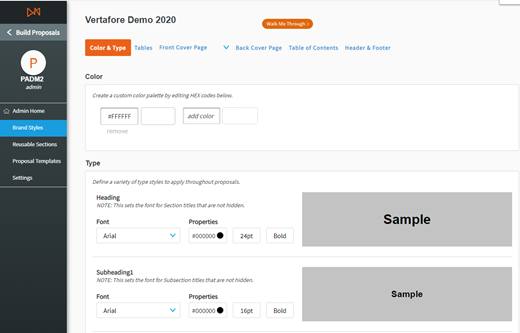
Color
You can create a quick-access color palette for your new Brand style. Select as many colors as you need to use throughout your proposals. For example, these colors could be those set out in your organization’s style guide.
To choose a color, you can use the color chart or a specific HEX code or RGB combination.

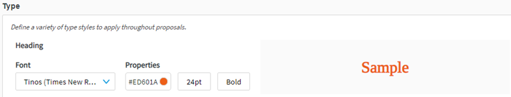
Type
In this menu, you can format five types of text for use in your proposals:
- Heading
- Subheading1
- Subheading2
- Body
- Table Heading
- Caption
- Custom

In each case, start by selecting your desired font. There are currently four fonts available for Proposal Builder:
-
Arial
-
Muli (Century Gothic)
-
Lato (Calibri)
-
Tinos (Times New Roman)
-
Arimo (Helvetica)
-
Lora (Baskerville)
-
Raleway (Verdana)
-
Open Sans (Tohoma)
-
Source Serif Pro (Georgia)
Then select your color, font size, and style.
Once you have customized your text types, click Save. From here, you can continue on to the Tables section by clicking Next.
Tables
In Tables, you can set the standard appearance of each table that will appear in your proposal. You can review and set the color and type style for headers and rows, as well as the color width of the table border.
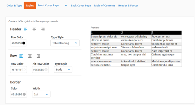
Once you’ve selected your Tables options, click Save and continue to the Front Cover Page Section by clicking Next.
Simple Front Cover Page
In this section, you can configure the appearance of the front cover page for proposals created using a particular Brand Style.

Set up Document
-
Select the orientation of your document.
-
Portrait
-
Landscape
-
-
Next, select the layout template. Here you will have four options that allow you to choose where certain information will go on the proposal’s cover page. Below are the four options (reads from left to right). You can preview your selection on the right-hand side of the page.
-
Background color, the logo in the bottom-right corner, text in center of page
-
Background image on bottom third of cover page, logo at the top-center, text in center of page
-
Background color, logo at top-center, text in center of page
-
Background image on full page, logo at center, text at center below logo.
-

Cover Page Background and Logo upload
Here you can upload your Cover Page Background (or set your background color) and Logo. Alternatively, you can choose background color instead of an image. Size and resolution recommendations are included with for the background images of each layout template.

- Drag and Drop your image into the designated box or click on the box to Upload a Logo.
-
Next, select you Cover Page Background:
-
Upload Image
-
Select background color

OR:

Document Text
You can select and format which text appears on your cover page by choosing which to toggle ‘On’ or ‘Off.’ You can also select different Type Styles and Colors for each piece of text.
- Proposal Name
- Policy Period
- Presented By Name
- Account Representative
- Account Representative Email
- Account Executive
- Agency Contact Info
- Presented On Date
- Insured Customer Name
- Effective Date

Once you’ve selected your Front Cover Page options, click Save and continue to the Back Cover Page by clicking Next.
Custom Front Cover Page

|
The Customer Cover Page editor is not supported by Internet Explorer (IE) or Edge. Please use Google Chrome for the best experience. You can copy and paste the URL from the top of this page into Chrome and edit there. |
- In the Brand Styles Section, click the drop-down arrow next to Front Cover Page and click Custom Cover Page.

Custom Cover Page Option

|
|
Note: The right-side menu is where you will be able to: • Edit Content • Add Content • Move/Delete Content • Resize Content |

|
|
The Custom Cover Page section enables you to design your cover page any way you want in any order. However, we suggest following the steps below for your first time. |
-
Begin by adding a Background to your cover page. Click the Add button and then either drag your image to the Background box or click the Drag and drop or click to upload button. Upload your image from your file browser and click Open.


- If you do not want a background image you have the option to set a Background Color or you choose to not include a background and continue to step 3 below.


Adding Elements
-
This section will cover how to add elements to your cover page:
-
Text boxes
-
Images
-
Dividers
-
Spacers
-
-
When adding any element you need to look for the solid black line that appears when you are dragging it to the desired location.
-
When adding any element you need to look for the solid black line that appears when you are dragging it to the desired location.

-
Depending on where you want to place an element you’ll notice that the black line will move accordingly.

Add Element to the Right

Add Element to the Bottom
-
Next, you can add your company’s logo or other images by clicking the Image icon at the top and dragging the icon onto the cover page.
-
You’ll notice a new image holder pop up on your cover page.

- Click the Edit button (pencil icon) on the right-hand side, and then click the image holder. You’ll notice a box appear that says click to upload. Click the box.

-
Choose your logo from your file browser and click Open. You will now see your logo over your background. The logo may appear either very large or small, so you will need to resize the logo.

-
To resize your logo, click the Add button. Then click-and-drag the Spacer option to the top, left or right sides of the cover page, depending on how you want the logo positioned.
-
Once your Spacers are placed, you can adjust them in the Edit section. Notice the box at the top. From Edit, you can drag the Spacer down to where you want your logo to be located.
|
|
Note: Be sure to click-and-drag the two lines on the Spacer.
|

-
With your Logo set, we can move on to adding Text to your cover page.
-
Click the Add button. Click-and-drag the Text box to where you would like text to be placed on your cover page.

- To add text, click the Edit button and then begin typing in the text box. Once you have entered your text, you have two options for editing:
On the top of the cover page, you will notice a bar with several different options.
- # Insert Dynamic Field
Select Font Style (this is pulled from the Color and Type section of the Brand Styles that you previously set). You can go back to that section and edit as needed.
- Alignment Options
- Justify
- Font Color

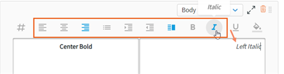
- If you click and highlight your text, you will notice another option for editing text. Your options include:
- Bold
- Italicize
- Underline
Font Color
Font Style
Font Size

- Once your options are selected for your text, click out of the text box to see how your cover page is looking.

- Once your Front Cover Page is complete, click save at the bottom.
Resize Feature
-
In this section, you have the ability to resize any of the elements. Click the Resize button on the right-hand side menu.

-
You will now see small black lines on either side of your element. When you hover over the lines, they will expand so you can easily see what side you are adjusting. Click the black line of the side you wish to expand and drag.

Preparing to Resize

Resized Logo/Image
Delete Feature
-
In this section, you have the ability to delete the items you’ve added. Click the Move/Delete button on the right-hand side menu.

-
Notice the orange trash can at the bottom. Select the item you’d like to delete and drag it to the trash can.

-
The item you selected is no longer in view.

Back Cover Page
As with the Front Cover Page, you can:
- Set up the Document’s Orientation and Layout
- Upload a Logo
- Set a Cover Page Background
- Add Agency Contact information.

Once you’ve selected your Back Cover Page options, click Save continue to the Table of Contents by clicking Next.
Table of Contents
You can decide whether to include a table of contents in your proposals.

Table of Contents (Off)
If you choose to include a Table of Contents, you will be able to configure the appearance of:
- Sections
- Subsections
- List Type
- Dotted Line
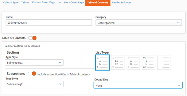
Table of Contents (On)
Once you have formatted your Table of Contents, click Save and continue to the Header & Footer Section by clicking Next.
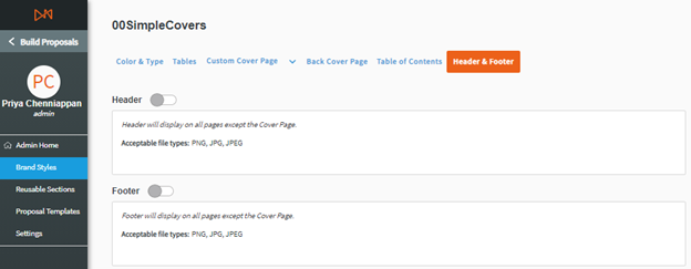
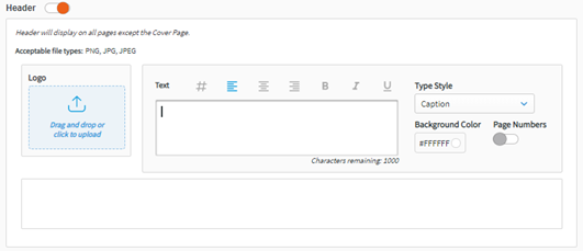
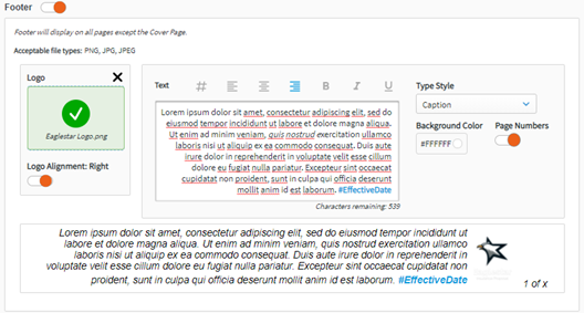
Header & Footer
In this menu, you can choose to include and customize a header and/or footer, which will appear on all pages of your proposals except for the cover pages and the table of contents.
Header Options (Off)
For each header and footer, you can:
- Upload a Logo positioned to the left-hand side
- Include up to 1000 characters of Text
- Select a Type Style for the text
- Add a Background Color
-
Align the Logo on the Left or the Right
- Include Page Numbers
When finished, click Save and move on to Reusable Sections.

|
|
Note: Brand Styles must be in Active status to be used in creating proposals. |
Setup Reusable Sections
In Reusable Sections, you can create standardized sections for proposals, such as introductions, line of business sections, and legal disclosures. This helps to standardize content across the proposal templates that you will create. For ease of access, you can also create different categories in which to save your sections. This could, for example, simplify your organization of Reusable Sections across different offices, regions, or end use.
To begin, click Reusable Sections on the left-sided menu of Proposal Builder.
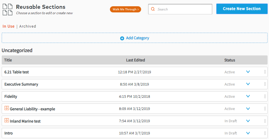
Categories
Click Add Category to add a new category of Reusable Sections, to help you organize them.

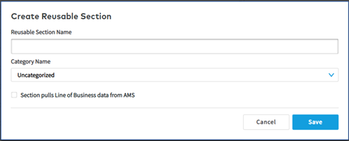
Create Reusable Sections
You can create two kinds of Reusable Sections:
- Sections that contain user-created content only, such as text, tables, and images.
- Sections that contain line of business data from Sagitta alongside other user-created content.
- In each case, click Create New Section in the upper-right corner of the Reusable Sections page. You can now name and categorize it. If your Reusable Sections will only contain user-created content, click Save.
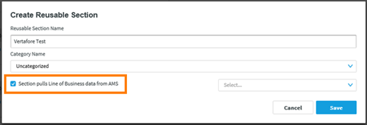
- To create a section that includes data from Sagitta for a particular line of business, tick the box next to “Section pulls Line of Business data from AMS”. You will need to select from the dropdown menu from which line of business to import information.
- When finished, click Save and you will be taken to the Section Editor.
Lines of Business
Commercial Lines
- General Liability
-
Business Auto
-
Workers Compensation
-
Commercial Property
-
Umbrella/Excess
-
Equipment Floaters
-
Misc Coverages
-
Commercial Flood
-
Garage & Dealers
-
Builder’s Risk
-
AR & Valuable Papers
-
Glass & Sign
Personal Lines
-
Watercraft Coverage
-
Personal Auto Coverages
-
Personal Umbrella Coverages
-
Homeowner
Policy-Level Data
-
Locations
-
Drivers
-
Vehicles
-
Named Insured
-
Service Team
-
Policy Detail Info
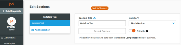
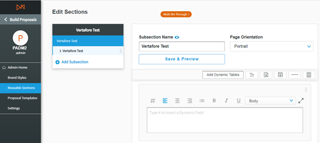
Section Editor
Editable Section toggle
Admins can decide whether a particular section can be edited or not by the Account Managers. This means that the Admin can build the section to be standardized for their organization and potentially mark this content as fixed for all users, so that it is identical in each proposal.
In Section Editor, toggle ‘On’ or ‘Off’ as desired
- On: Editable: Account Manager can edit content, including adding, deleting, and renaming subsections.
- Off: Not Editable: Account Manager cannot edit the content of section in any way.
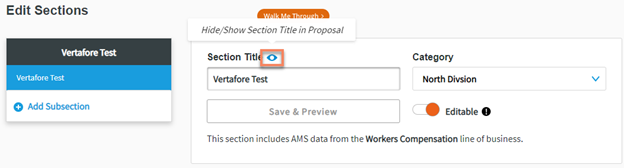
Optional Titles
- Admin users now have the option to show or hide titles of their Reusable sections and/or Subsections.

Title hidden in Subsection
Title visible in Subsection
Add a Subsection without Sagitta data
- Click Add Subsection.
- Name your subsection, then click Save.

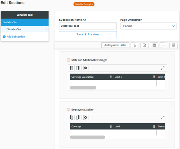
Within each subsection, you can include a combination of five elements:
- Text block(s)
- Image(s)
- Table(s)
- Divider Line(s)
- Page Break(s)
- Add Dynamic Elements (if importing data from AMS360)
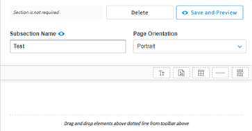
To include one of these elements, drag and drop it into the subsection. You can then edit it and re-order the elements.
You have the option to include:
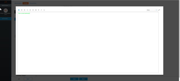
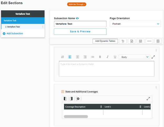
- Text Block: Enter and format text using standard Word editing options
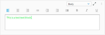
If you need to edit a significant amount of text, you can click the  to expand the editor to a larger view. Click the
  to return to the standard editor view.
Side-by-Side Text Columns
Proposal Builder now supports side-by-side text columns. This is a new button on text boxes that, when clicked, will display two input fields.
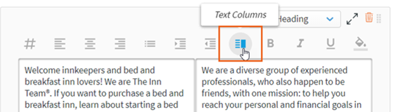
Formatting options (font, alignment, bold, italic, etc.) for the text areas are separate, and apply to whichever box is selected.
When exported to a Microsoft Word or PDF file, they will show as text columns filling to the margins. Both admins and end users will have this option available.
Indent Text Fields
Proposal Builder now has an indent option in the text box to ensure the text has consistent spacing.
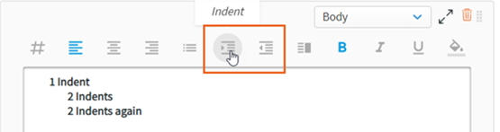
-
Indenting applies to the entire line
-
Indenting right-aligned text is not supported
Color Fill for Text Fields
Proposal Builder now supports fill colors in text boxes. Once applied, the color will only appear in a preview or final document.
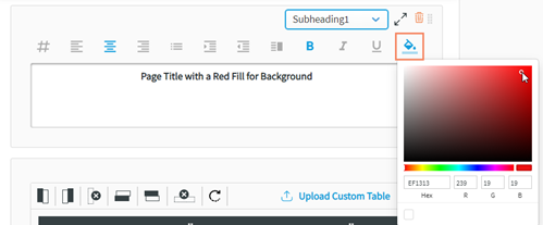
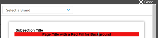
This feature is only available to the admin in the Edit section. It is not available for end-users or in the Edit Proposal area.
- Add File: Upload an image and set its alignment and size within the subsection
We recommend 1 or 2 page PDFs only, and when uploaded they will fill the page.


- Add Table: Enter data and edit the structure of your tables using the buttons on the left-hand side to add or remove columns and rows. Hover over each button for an explanatory tooltip.

- As with text editing, you can expand the editor to a larger view.

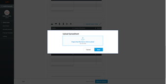
- If you have already prepared data outside of your management system, such as a marketing summary or premium summary, you can upload this data from a spreadsheet into Proposal Builder using the Upload Custom Table feature. This works with CSV, XLS, and XLSX files.


Vertical Tables
Proposal Builder now supports vertical table layouts for both Dynamic Tables and Custom Tables. This is a new button added to the table toolbar.
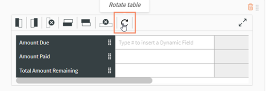
Excel and .csv uploads must be added when the table is horizontal, then rotated afterwards.
- Divider Line: Add line to separate content within the subsection.

- Page Break: Insert a page break to start content on a new page.

|
|
Page breaks are automatically built between Sections, and breaks adapt based on orientation to prevent images and text blocks from being cropped. |
- After creating your section and its subsections, click Save to Library and Exit to return to the Reusable Sections menu.

Add a Subsection with Sagitta Data
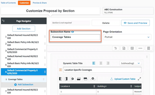
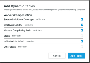
If you have created a new section that can import Sagitta policy and line of business data, you can add placeholders amongst other elements by clicking Add Dynamic Tables in a subsection that you have created. For example, you may wish to combine coverage limits and vehicle schedule infor-mation from Sagitta with additional information that users need to input themselves.
When you select to Add Dynamic Tables, a modal will appear from which you can choose which tables to include from the line of business you selected when you created the section. As an example, the modal in the screenshot below gives the user the choice to include the Business Auto tables.
- Tick the boxes of the tables you wish to add to your subsection.
- Click Add Elements.
The placeholders will be replaced by data imported from Sagitta when the Account Manager starts a proposal from their Sagitta launch point.
After adding your Dynamic Elements placeholders, you can also add other elements that you require to complete the section, such as text, images, or tables.
- When finished, click Save to Library and Exit to return to the Reusable Sections menu. When you have created all the Reusable Sections that you required, click on Proposal Templates on the left navigation bar to start building your proposal templates.
|
|
Remember: Reusable Sections must be in Active status to be used in creating proposals. |
Setup Proposal Templates
With Proposal Templates, you can preset the order in which Reusable Sections appear in your organization’s proposals. This will help standardize their appearance. From the Proposal Templates menu, you can create categories to help organize proposal templates. Each proposal template can also be described by Account Size and Insurance Class for additional ease of classification.
|
|
Note: Depending on how you have set up your Reusable Sections, you might want to categorize your proposal templates by region or state, target industry, or another helpful way to organize your Proposal Templates. |
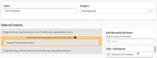
- Click Create New Template.
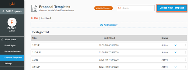
-
Enter your Template Name, select a Category Name, and click Save.

Setting whether a section is Required
The Admin can use the Required toggle to set whether a section must be included when a user chooses a particular template. To set whether a Reusable Section is Required:
- Click and drag a section into the proposal template structure
- Toggle On or Off whether the section is required
- On: Required: The user cannot delete the section
- Off: Not Required: The user can delete
Interaction between Required and Editable
|
Section settings |
Account Manager functionality |
|
Required, Not Editable |
|
|
Required, Editable |
|
|
Not Required, Editable |
|
|
Not Required, Not Editable |
|
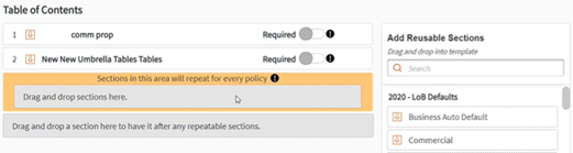
- From here, you will be brought to the Template Structure page where you can drag and drop the different Sections you have created.

- In the Table of Contents Section, you can add Reusable Sections and order them as required.
- Click Save to Library to finish.
|
|
Note: Brand Styles, Reusable Sections, and Proposal Templates must be in Active status to be used in creating proposals |
Setting up Reusable Sections
All proposal templates now have added functionality to allow for sections to repeat for every appli-cable policy. This will apply to any sections that are included within the orange box (repeatable box) that states “Sections in this area will repeat for every policy”. This feature also separates dynamic fields included in these sections.
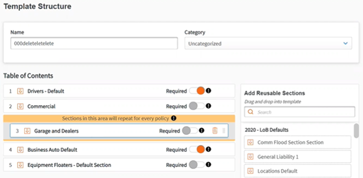
You can select additional sections to repeat by dragging and dropping them either from the Table of Contents or the Add Reusable Sections areas into the repeatable box.
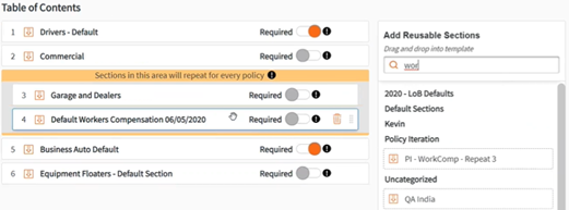
Sections in the repeatable box will be copied and added to the proposal once for every policy that is sent. For example, from the image above, sending three Workers Comp policies will result in three “Default Workers Compensation 06/05/2020” sections, each with data from one policy. Any section that is not included in the repeatable box will maintain its current functionality of being combined into one table, creating a summary-level table.
This functionality is available for all new and existing templates. In existing templates, the repeatable box has been added to the bottom of the Table of Contents section and will not impact existing templates unless a section is added to it.
If you have repeated section or subsection names with policy data, we recommend changing the name(s) using the editor in the Customize tab.